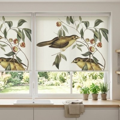
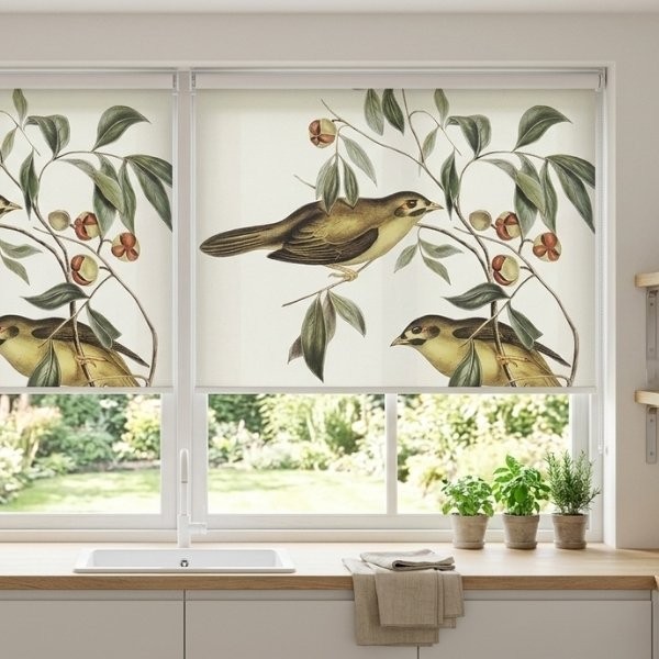
Window styling can completely change the perception of home space. Sometimes a small tweak is enough for a room to gain depth, freshness, and lightness, but an ill-considered purchase can create a sense of chaos or overwhelm. The color of blinds versus the color of walls is one of the most important visual relationships in any room - the window recess is a natural focal point, determining how the entire composition is perceived. If you’re wondering what to match the color of the blind to, how to work with light, and how to make the whole space look professional, the practical tips below will guide you through this process step by step.
Monochromatic calm - something for lovers of harmony
The monochromatic style creates a cohesive and orderly interior, dominated by balance and calm. Instead of looking for loud combinations, many designers recommend matching the color of the blinds to the walls based on the tone-on-tone. This proven method involves choosing a fabric in a similar shade, but 1–2 tones lighter or darker than the dominant wall color. Choosing a blind a tone lighter than the wall brings a sense of lightness and brightness, whereas a fabric a tone darker builds depth and an elegant frame for the view outside the window.
Such a subtle move prevents the covering from blending completely with the plaster into a uniform, monotonous plane, while also avoiding a sharp boundary that could disturb the proportions. Blinds in neutral tones create a harmonious space, fitting perfectly into the assumptions of japandi, scandi, or modern minimalism.
Size is of particular importance. In rooms below 12 m², experiments with contrasts can be risky - in small rooms it’s best to keep the blind in the tone of the wall. This blurs visual boundaries, and blinds in neutral colors visually enlarge the space. When the fabric shade smoothly relates to the background, the room appears taller, wider, and more orderly.
Bold contrasts - how to energize the interior without creating chaos?
If you want expressiveness, contrasting combinations are an excellent path to your goal. Blinds in strong colors can act as an accent in the arrangement, breaking up monotony and giving the whole an individual character. It’s worth remembering the golden 60-30-10 rule, where the base constitutes 60% of the decor, the complementary color 30%, and the strong decorative accent just 10%.
In modern interiors, deep, vivid tones are extremely popular. Dark blinds give the interior character and build depth, creating an elegant frame for shafts of light entering inside:
Bottle green - introduces noble calm, pairing perfectly with light wood, brass, and neutral planes.
Navy blue blinds - create a dignified mood conducive to focus, working beautifully in home offices or elegant living rooms.
Mustard yellow - brings dynamism, warmth, and retro energy, excellently breaking up cool bases.
Olive green - a soft, natural tone that enlivens the room without introducing visual noise.
Remember, however, that dark coverings have their physical and visual specifics. Dark blinds absorb up to 80% of energy, and they can also visually shrink small rooms. For this reason, dark blinds work best in large, bright spaces, where abundant space and daylight neutralize the risk of overwhelm.
Light colors - a universal canvas for experiments
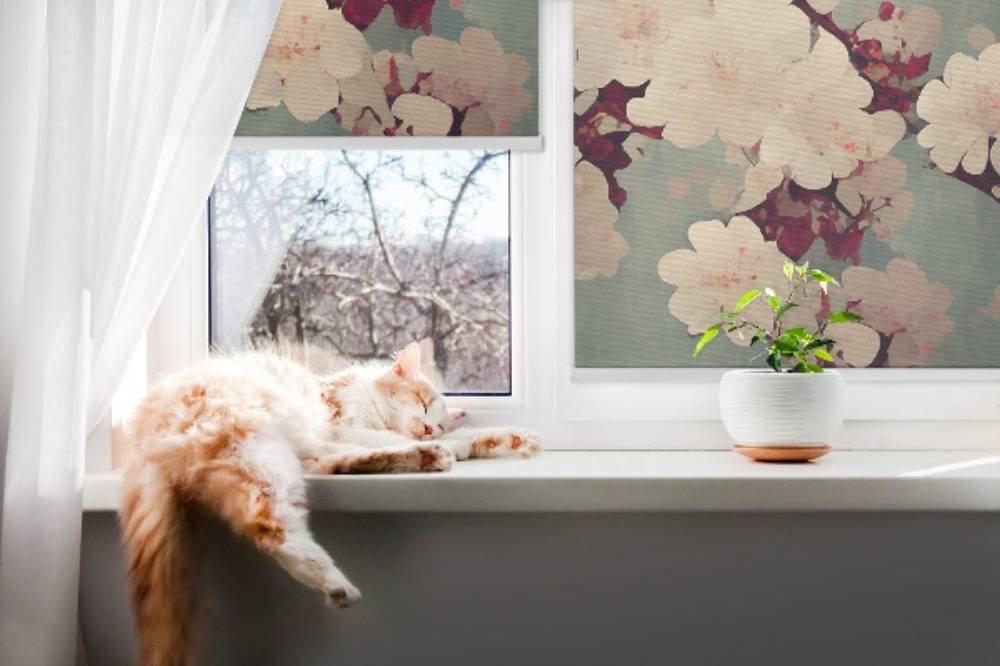
A light backdrop is every decorator’s dream because it gives almost unlimited freedom when choosing the color of blinds. White walls go with almost any blind color, becoming a universal canvas for varied textures. However, you need to watch the color temperature. With cool white, white blinds and cool grays work great, while with walls in an ivory tone, a blind in ecru or off-white performs perfectly.
Meanwhile, warm beige on the walls creates a dream backdrop for earth tones. Regardless of the wall color, blinds in subdued earth hues create a harmonious atmosphere conducive to relaxation. Cool white walls combined with pure white, ash gray, or graphite deliver modern freshness, clear contrast, and a minimalist touch. Warm écru white paired with ivory or linen brings coziness and softness. Beige or sandy surfaces combined with a fabric in sandy beige form a warm, organic monolith, and light gray with Scandinavian graphite ensures perfect visual balance.
In beige interiors, a blind in the color of natural linen works well with beige walls, introducing a pleasant, noticeable fabric texture. If you want a romantic finish - for example in a children’s room or a moody bedroom - an excellent choice is pastel blinds, e.g., powder pink or soft mint. Pastel blinds harmonize with light fabrics and wood, giving the interior a subtle, fairy-tale character. Keep a simple rule in mind: for a warm backdrop (cream, beige), it’s best to choose écru, linen, sandy beige, and warm pastels, while for a cool backdrop (pure white, ash gray), alpine white, grays, and cool graphite are the right match.
Dark and saturated walls - how to choose coverings for graphite, bottle green, or navy?
Deep colors on the walls are a trend that adds a luxurious flair to interiors. With dark walls, however, it’s crucial to define precisely what effect you want to achieve.
If your priority is to balance the weight of a dark wall, choose light blinds. Light blind colors reflect up to 70% of light, brighten the interior, and add lightness. Thanks to this, incoming sunlight bounces off the fabric and travels deeper into the room, eliminating the feeling of a gloomy „cave”. Light fabrics with a visible weave, reminiscent of raw linen or thick cotton, will introduce a pronounced texture contrast.
When the goal is to create an intimate, club-like mood, darker fabrics hung against bottle green or graphite will provide a cohesive, enveloping space. Remember that when choosing the color of blinds, you should take into account the color of the walls and furniture as well as other furnishings - a dark covering should correspond with the sofa upholstery, rug, or picture frames.
Window exposure to light and color perception
The choice of blind colors affects the visual effect of the room, and the final result largely depends on how the sun operates in it. The color of the blind fabric affects the amount of light let in, and the direction the windows face completely changes the perception of fabrics:
North- and east-facing windows: Cool, diffuse, or short-lived light reaches these spaces. By choosing dark, cool colors, you risk creating an unpleasant, gray twilight. Far better are light colors, neutral colors, and warm shades that visually warm the space.
South- and west-facing windows: Rooms are intensely sunlit for many hours. Here, cool grays, dark blinds, or tightly woven fabrics will perform excellently, limiting excessive heating and reducing glare.
Extremely important, too, is color temperature - you shouldn’t combine warm wall tones with cool blind tones without a clear stylistic justification. A cool white blind next to a warm, yellowish wall will make the wall look dusty, and the blind unnaturally sterile.
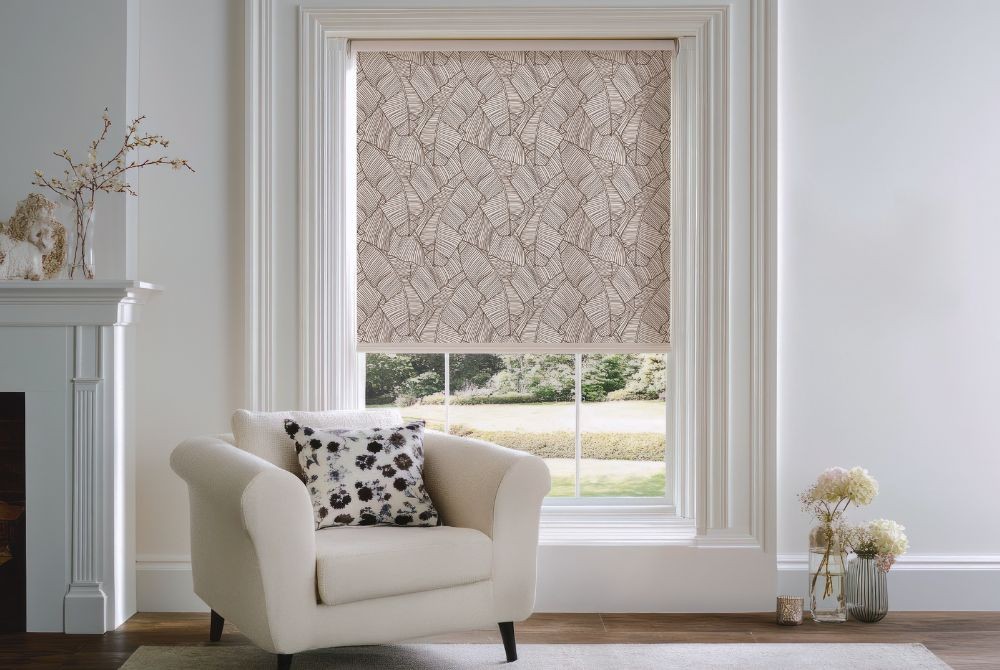
If you want smooth control of lighting, consider day-night blinds. Their striped structure allows you to precisely dose illumination without fully uncovering the window. Also remember that although external blinds bear the main burden of thermal insulation, the coverings mounted inside determine the atmosphere of the home.
How to make the final decision?
When planning color changes and the final window decor, look at your home as a coherent whole, not a set of random elements. Remember that a fabric viewed from different angles looks different in daylight than in evening, artificial lighting - therefore it’s always worth verifying the color directly at the window frame before installation.
A refined interior arrangement is based on dialogue between elements - the blind cannot be treated in isolation from the color of the plaster, furniture, or textiles. By consciously managing color temperature and matching the saturation of the coverings to the scale of the room, you will create a harmonious space that delights every day with its coherence and polished style.